


University Pointe Website Redesign
Academic Project • UX Research • Information Architecture • Usability Testing • 2025
Improving apartment search usability through UX research and information architecture redesign.
Role
UX Researcher
Information Architect
UI/UX Designer
Timeline
4 Months
Participants
17 Survey Participants
5 Usability Testing Participants
Tools
Figma , Excel, Goole Form, Surveymars
Project Overview
University Pointe is an apartment community located near Arizona State University.
As both a resident and researcher, I observed that important rental information was difficult to locate, making apartment comparison unnecessarily frustrating. Through UX research, usability testing, and information architecture redesign, I identified key usability barriers and developed solutions that improve information discoverability and apartment comparison workflows.
The Problem
Users struggled to find information needed to make housing decisions. Research revealed three major usability issues:
01 Rental pricing information was difficult to find
Users spent significant time searching for pricing, deposits, and availability information.
02 Content hierarchy was unclear
Important information was buried inside lengthy blog content with weak visual hierarchy.
03 Comparing floor plans was inefficient
The website lacked tools for filtering and comparing apartment options.
Why This Project Matters
Finding off-campus housing is one of the most important decisions for university students. However, critical information such as pricing, deposits, and room availability is often difficult to locate on rental websites. This project explores how information architecture and content organization can improve apartment-search experiences and support faster housing decisions.
Research Insight
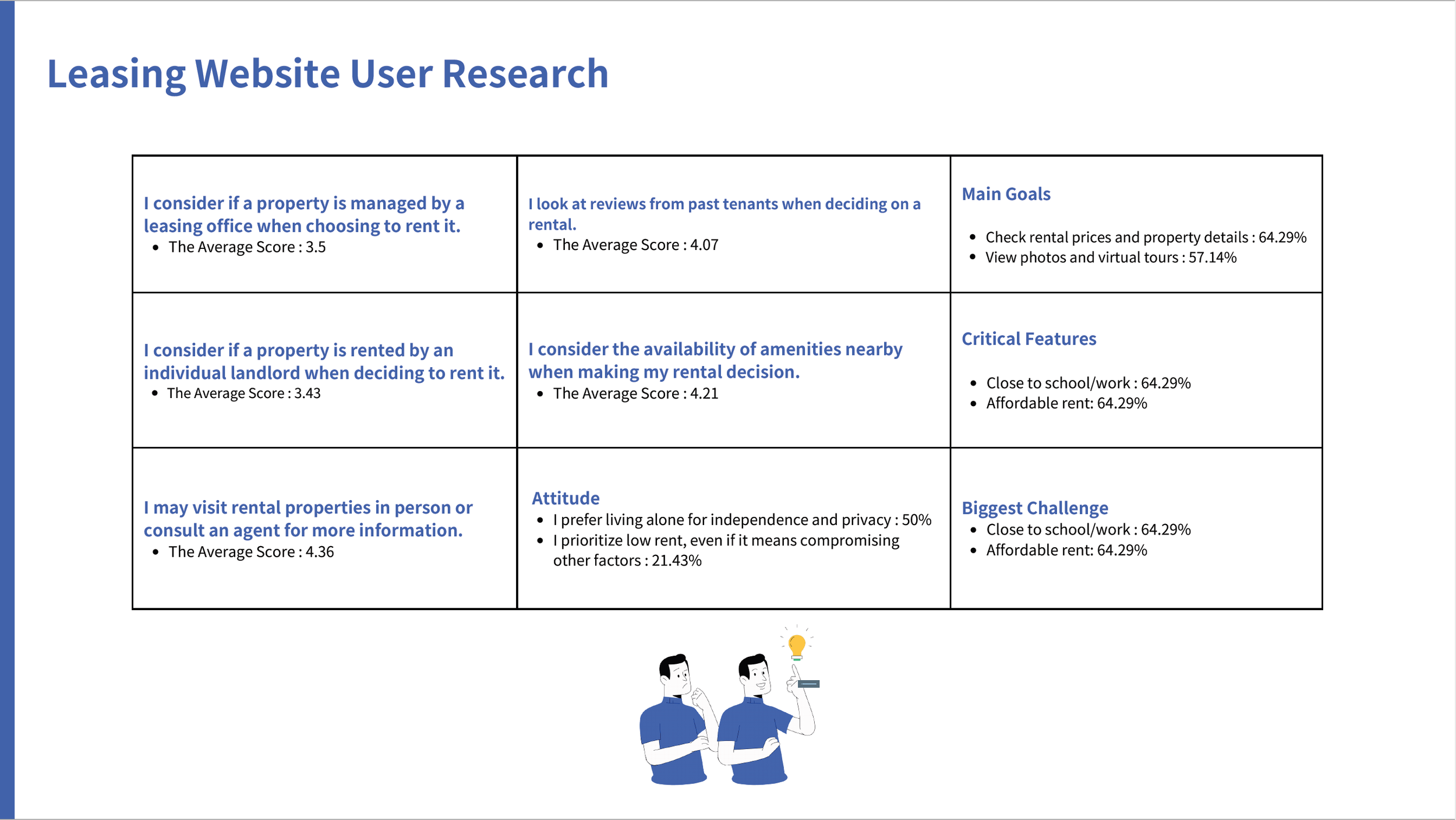
01 Users prioritize pricing and availability information when evaluating rental options.
Users considered pricing and availability information the most important factors when evaluating rental options.
Evidence
92.86% wanted clear property information
78.57% ranked rent price as a primary decision factor
64.29% reported unclear rental information
Survey findings showed that rental price, property information, and availability were consistently ranked as the most important factors when searching for housing.
02 Navigation labels did not match users' mental models.
Users expected pricing information in predictable locations but struggled to find it within the existing navigation structure.
Evidence
80% felt confused or frustrated during pricing-related tasks
Users expected pricing information in obvious locations
Participants struggled to understand where key information was stored
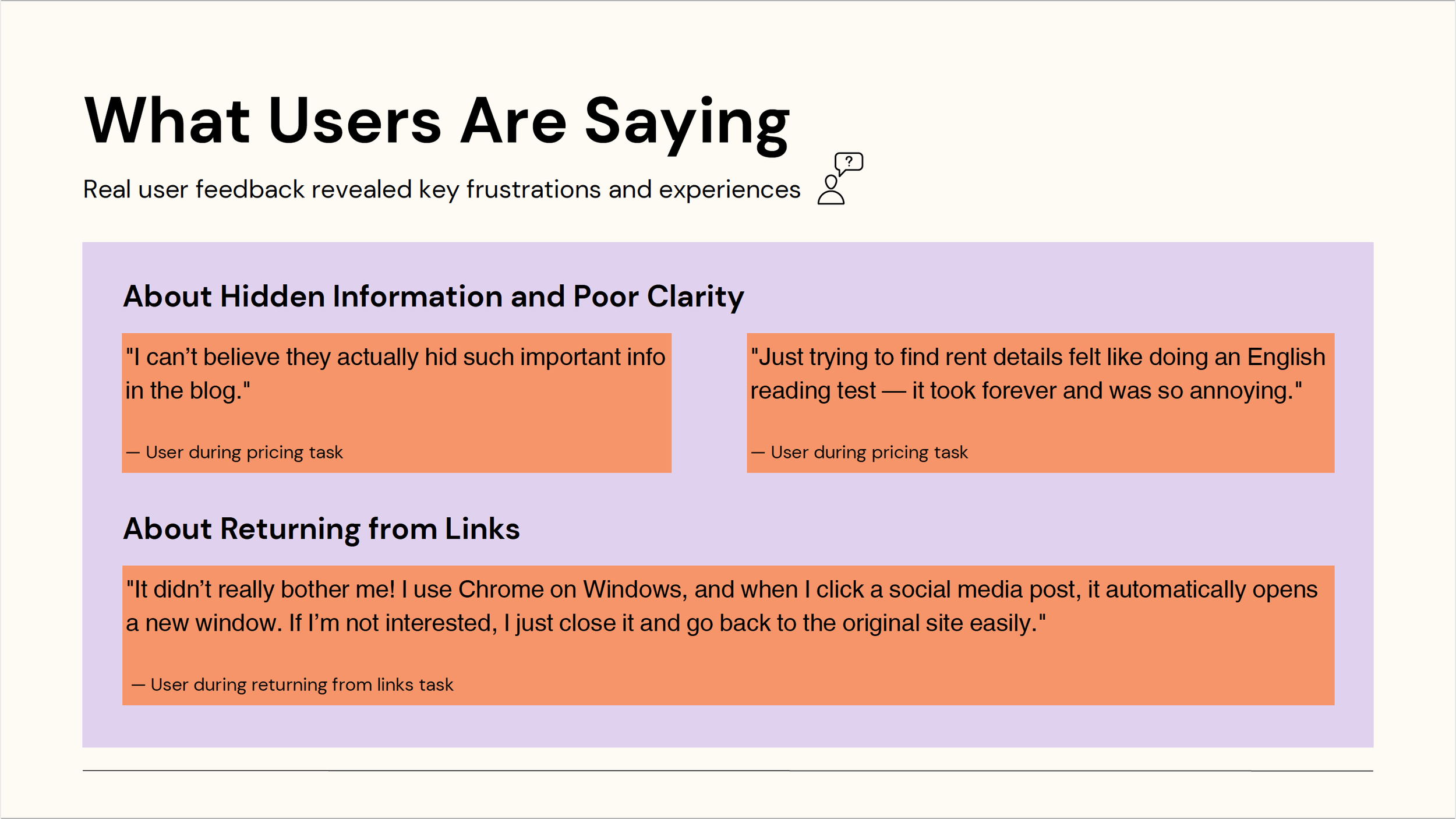
Usability testing revealed that 80% of participants experienced confusion when searching for pricing information.

User quotes further illustrated frustration caused by hidden information and unclear navigation.
03 Users wanted faster ways to compare apartment options.
Users lacked efficient ways to compare apartment options, leading to time-consuming manual browsing.
Evidence
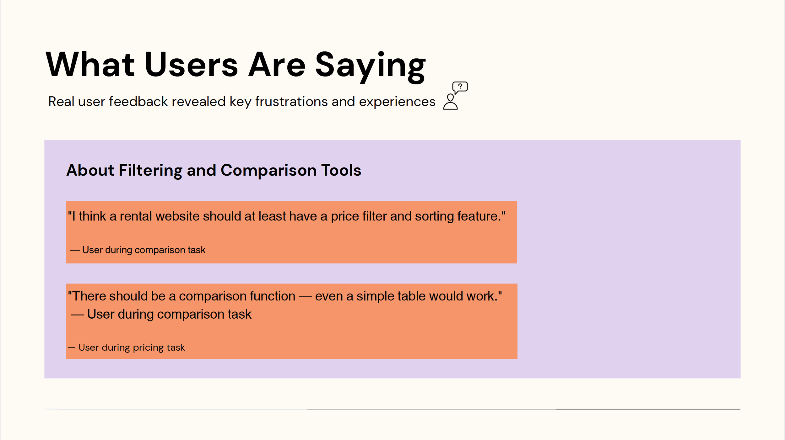
80% struggled to compare apartment options across communities
Users requested filtering features
Users requested side-by-side comparison tools
These comments support the finding that users wanted faster and more efficient ways to compare apartment options.
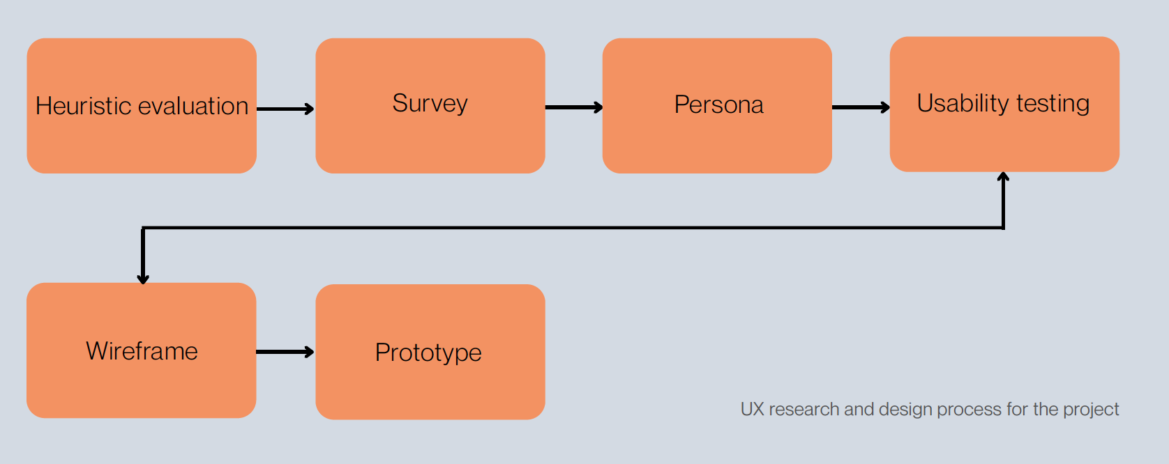
Research Approach
To better understand user behavior, I applied multiple UX research methods throughout the project.
-
Method
I conducted a heuristic evaluation of the University Pointe website to identify usability issues related to navigation, information accessibility, user control, and rental content structure.Goal
The goal was to understand where the existing website created friction before conducting user research and usability testing.Key Finding
The evaluation revealed that users may have difficulty returning from external links, comparing apartment options across multiple community pages, and locating complete rental information such as pricing, deposits, utilities, and availability.
-
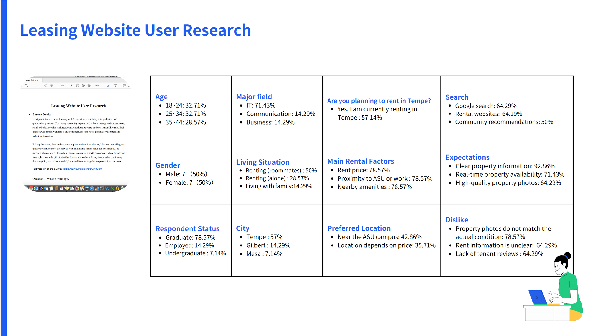
Method
I designed a 21-question survey combining qualitative and quantitative questions to understand how users search for apartments, what information they prioritize, and what frustrates them when using rental websites.
Goal
The goal was to identify renters’ decision-making factors and validate whether pricing, availability, photos, reviews, and comparison tools were important to potential users.Key Finding
Survey responses showed that users prioritize rent price, proximity to school or work, nearby amenities, clear property information, and real-time availability. Many respondents also disliked unclear rental information and property photos that did not match real conditions.
-
Method
I created four renter personas based on survey findings and common rental decision patterns. These personas represented different user needs, including solo renters, shared-living students, budget-conscious renters, and international students.Goal
The goal was to turn research findings into user-centered design references and ensure that later testing tasks reflected realistic renter needs.Key Finding
The personas helped clarify that different users shared overlapping needs: transparent pricing, clear lease terms, easier comparison, trustworthy property information, and a more structured browsing experience.
-
Method
I conducted task-based usability testing with 5 participants. Participants completed realistic apartment-search tasks, including finding rental pricing, understanding costs, returning from external links, and comparing two-bedroom apartment prices across communities.Goal
The goal was to observe how users actually interacted with the website and determine whether the research findings appeared during real use.Key Finding
Testing confirmed that users struggled most with unclear rental information, inefficient comparison workflows, and disorganized content. Participants often described the experience as confusing or messy, especially when trying to compare prices across communities.
Design Solutions
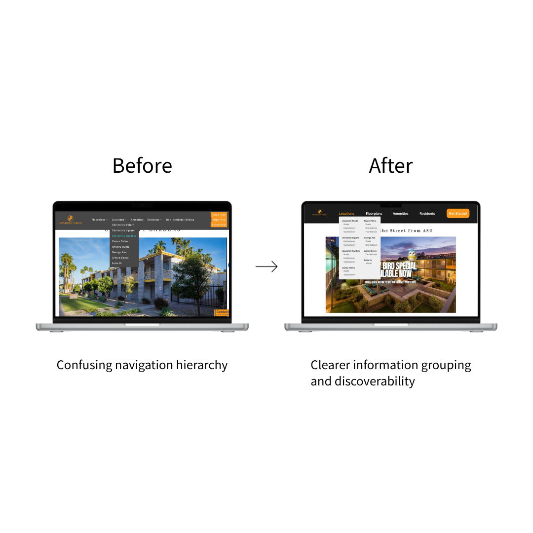
Solution 1: Redesign Navigation Structure
Challenge
Users struggled to locate rental pricing, deposits, and availability information. Usability testing revealed that participants often felt unsure where important housing information should be located, resulting in unnecessary navigation and search effort.
Design Decision
I reorganized the navigation hierarchy to better align with users’ mental models. Key rental information was grouped more logically and surfaced through more visible entry points, reducing the effort required to locate critical housing details.
Result
The redesigned navigation structure improves information discoverability and helps users understand the website architecture more quickly.
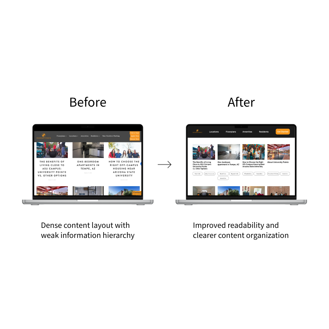
Solution 2: Improve Content Hierarchy
Challenge
Important housing information was buried within long-form blog content, making it difficult for users to quickly identify relevant information. The existing layout lacked clear visual hierarchy and required excessive reading before users could find what they needed.
Design Decision
I redesigned the content layout to improve scannability and information discoverability. Content was reorganized into clearer sections, supported by stronger visual hierarchy, more structured grouping, and improved content categorization.
Result
Users can scan content more efficiently and identify relevant housing information with less effort.
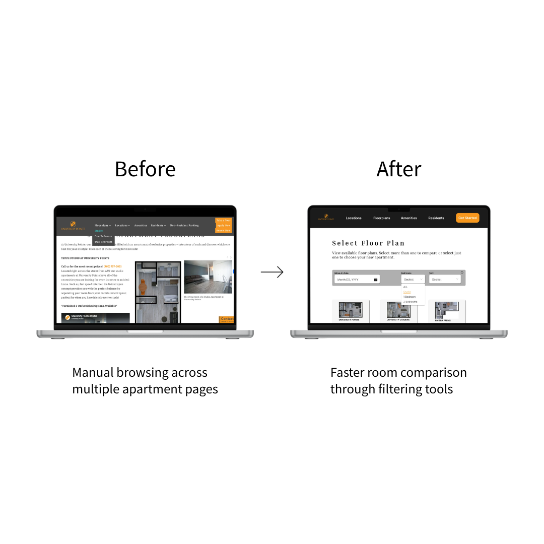
Solution 3: Add Floor Plan Filtering
Challenge
Users lacked efficient ways to compare apartment options. During usability testing, participants had to manually browse multiple pages to compare room types, prices, and layouts, creating unnecessary friction in the decision-making process.
Design Decision
I introduced a filtering system that allows renters to narrow available options based on criteria such as room type and availability. This design supports faster comparison workflows and reduces the amount of manual browsing required.
Result
The filtering feature enables more efficient room comparison and supports faster housing decisions.
Reflection & Takeaways
UX Problems Are Often Information Problems
Before conducting research, I assumed the website's biggest issue was navigation design. However, usability testing revealed that the root problem was information architecture. Users weren't struggling because they couldn't click the right button. They were struggling because the information structure did not match their mental models. This project reinforced my belief that good UX is not only about interface design, but also about how information is organized, communicated, and understood.
Outcome
What This Project Demonstrates
Conducted mixed-method UX research
Translated research findings into IA decisions
Designed solutions based on user mental models
Improved content discoverability and comparison workflows
Strengthened my ability to connect content strategy with UX design
Project Metrics
Research
17 survey participants
5 usability testing participants
4 renter personas
3 key usability issues identified
Design
14 wireframes exploring information architecture concepts
54 high-fidelity prototype screens
3 redesigned user journeys
3 interactive prototype flows
Selected highlights from the project are presented here.
For deeper research insights, UX decisions, and design iterations, view the full case study below.