

Overseas Budgeting App for International Students
Academic UX Project · Behavioral Budgeting Experience · 2025
Designed and evaluated a mobile budgeting app that simplifies multi-currency expense tracking for international students through user-centered design and iterative usability testing.
Role
Product Designer
Duration
2 months
(Course Project)
Tools
Figma
Zoom
Google Docs
Scope
UX Research
Wireframing
UI Design
Usability Testing
Deliverables
Mobile App Prototype
Usability Test Report
Iteration Proposal
Project Background
International students often struggle to manage their daily expenses across multiple currencies, which leads to confusion in understanding spending habits and maintaining a clear budget.
Existing budgeting tools rarely address multi-currency budgeting or the cognitive load of constantly switching between currencies.
Design Goals
01 /
Simplify expense tracking
02 /
Reduce cognitive load
03 /
Improve budgeting clarity

Research & Discovery
User Context
Frequently switch between local and home currencies
Make many small daily purchases
Need quick awareness of spending rather than detailed bookkeeping
Pain Points
Currency recognition
Category ambiguity
Disconnected budgeting workflow
Key Insight
Users don't just need a budgeting tool—they need a budgeting experience that minimizes cognitive effort when switching between currencies, categories, and budgeting decisions.
Product Principles
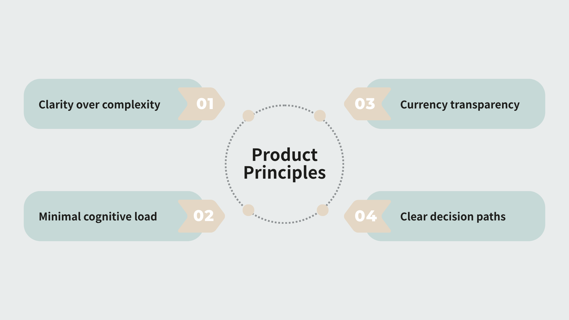
Design Process
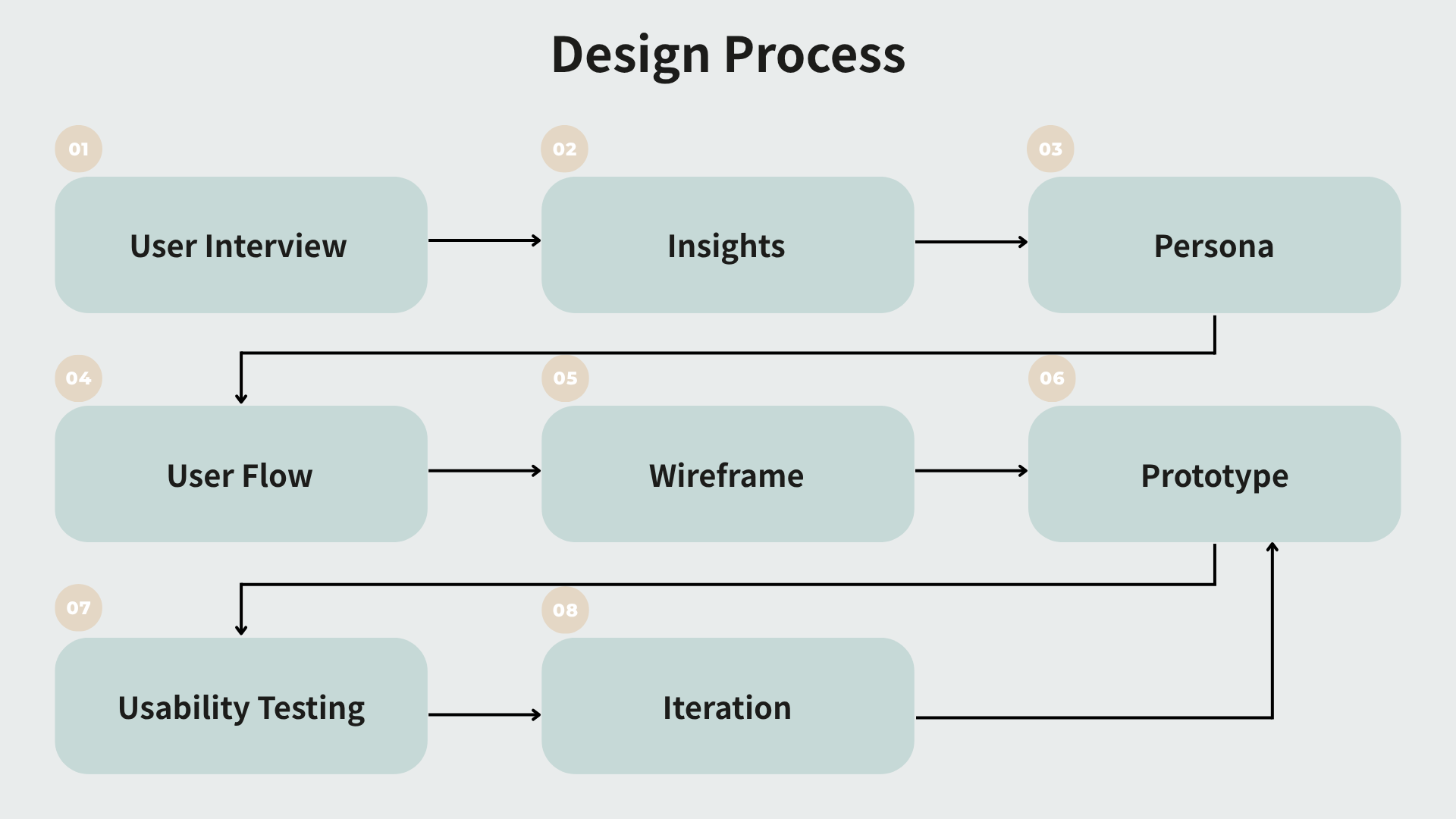
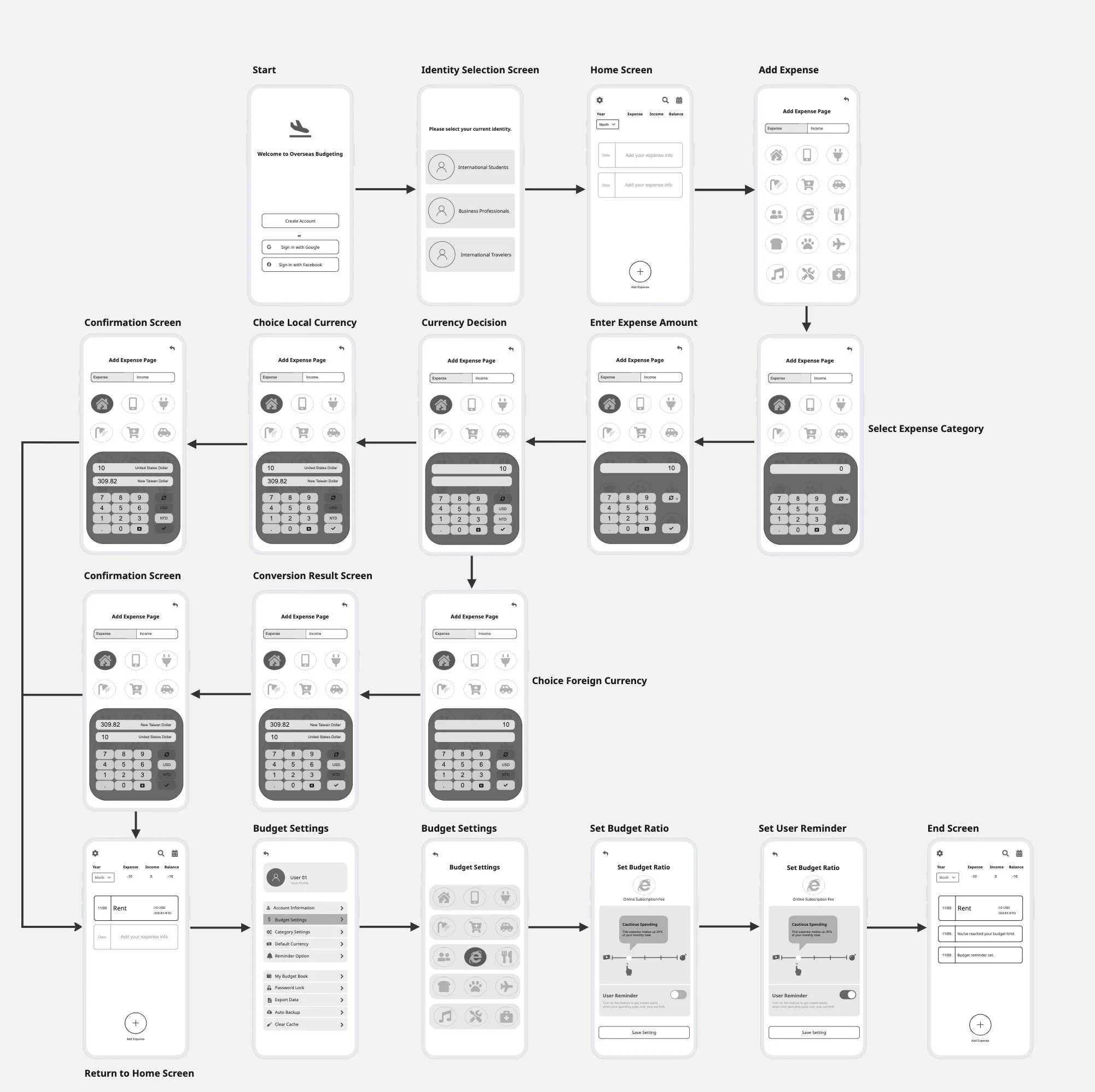
User Flow & Wireframes

Usability Testing
Evaluating the Prototype
To validate the usability of the prototype, I conducted moderated think-aloud usability testing with three participants. Each participant completed four representative tasks while verbalizing their thoughts, allowing me to observe both behavioral patterns and underlying reasoning.
Participants: 3
Method: Moderated Think-Aloud
Format: In-person & Zoom
Prototype: Interactive Figma Prototype
Research Goal: Evaluate the usability of onboarding, expense entry, currency conversion, and budgeting workflows.
Testing Tasks
Participants completed four core tasks representing the primary user journey.
Task 1
Select "International Student"Task 2
Record a $50 electricity expenseTask 3
Convert 50 USD to TWDTask 4
Set a monthly budget and enable reminders
Key Findings
Across the three usability sessions, several usability issues appeared repeatedly.
-
Observation
Every participant paused during onboarding before selecting an identity. Instead of recognizing that they could switch between user types, they searched for an "International Student" option on the current screen and hesitated before taking any action.
Evidence
The "Skip" button caused the greatest confusion. Participants repeatedly interpreted it as skipping the entire onboarding process, rather than moving to the next identity. Because only one identity was visible at a time, users had no indication that additional options were available. Several participants commented that they expected all identities to appear on a single screen so they could compare and choose directly.
Design implication
The onboarding flow should make available identities visible from the beginning. Displaying all user types together, adding pagination indicators, and replacing "Skip" with clearer actions such as "Next" or "Choose Other Identities" reduces uncertainty and helps users understand how the onboarding flow works before making their first decision.
-
Observation
Although participants eventually completed the expense-entry task, every user slowed down while choosing a category. Instead of recognizing icons immediately, they spent time guessing what each symbol represented before making a selection.
Evidence
Several icons were interpreted differently by different participants. Categories such as Social vs. Karaoke, Shopping vs. Grocery, and Internet vs. Subscription appeared visually similar, making users uncertain about which option best matched their expense. Participants also felt the category system was overly detailed and requested text labels and broader category groupings to reduce decision-making effort.
Design implication
Icons should support recognition rather than recall. Adding text labels, simplifying overlapping categories, and allowing users to create custom categories reduces cognitive load and enables faster expense logging.
-
Observation
The currency conversion task generated the highest number of questions during testing. Participants frequently stopped to verify whether they were viewing or editing the correct currency before continuing.
Evidence
Users were unsure which currency was currently active because the interface displayed only ISO abbreviations. Some participants even mistook the exchange icon for a Euro (€) symbol. Others questioned whether exchange rates were updated in real time and became confused when converted expenses displayed two currencies simultaneously, making it feel as though the same expense had been recorded twice.
Design implication
The interface should communicate system status more clearly by displaying the currency symbol, full currency name, and ISO code, replacing the ambiguous exchange icon with a standard double-arrow symbol, and allowing users to define a default currency during onboarding. These changes improve transparency and reduce uncertainty throughout the conversion flow.
-
Observation
Participants expected budgeting to be closely connected to expense management. Instead, many became uncertain after entering the Settings area because the budgeting interface looked almost identical to the Add Expense screen.
Evidence
Several participants questioned whether they were still editing an expense instead of configuring a budget. Users also expected budget adjustment and reminder settings to exist within one continuous workflow rather than being separated across multiple expandable sections. These interactions revealed that the current information architecture did not match users' expectations of where budgeting functions should live.
Design implication
Budget management should have a visually distinct interface and a simpler workflow. Consolidating related settings onto one screen and strengthening the visual distinction between budgeting and expense entry helps users build a more accurate mental model of the product structure.
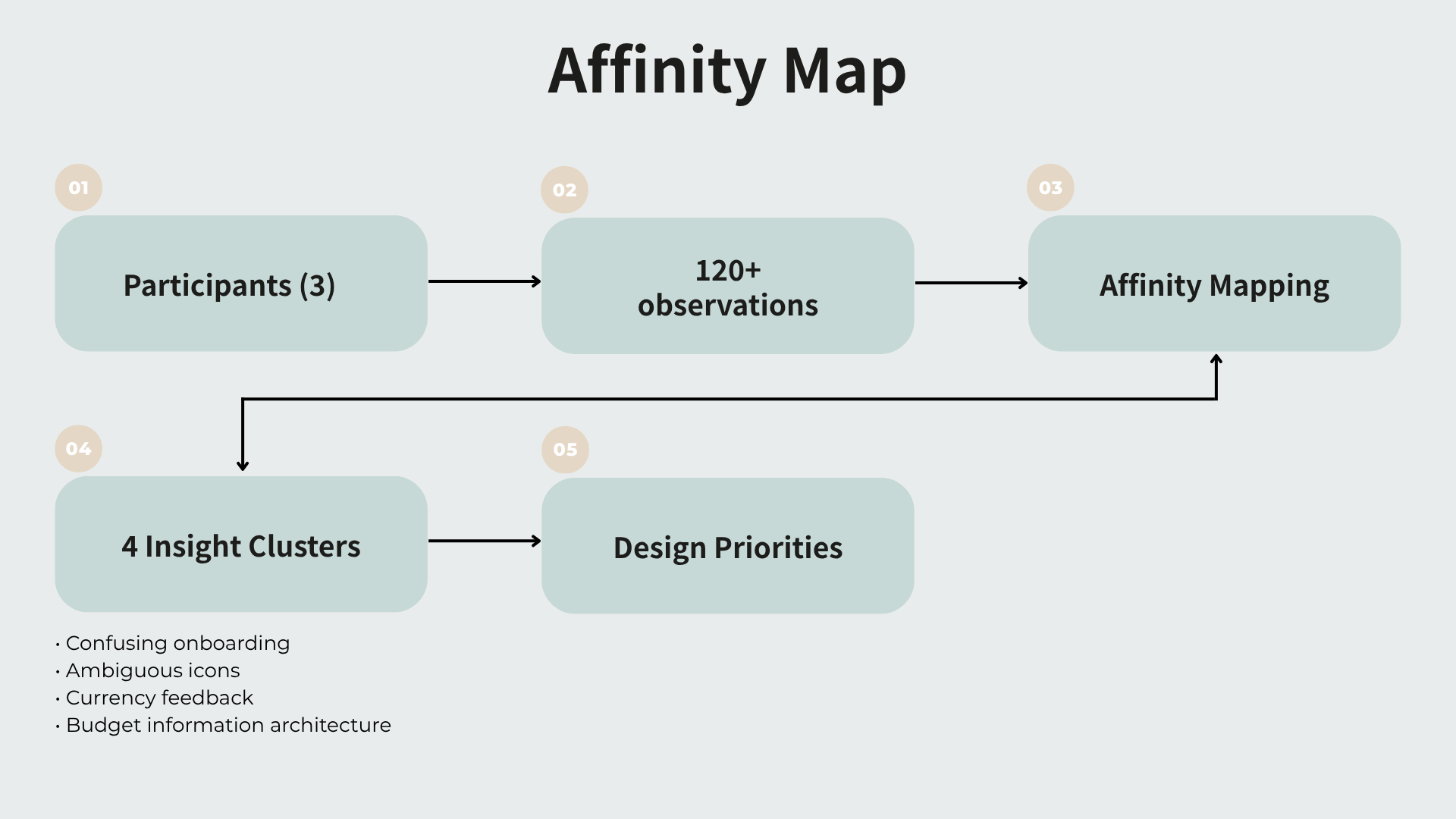
Iteration
Iteration 01 — Onboarding Improvement (Screen redesign)
Problem
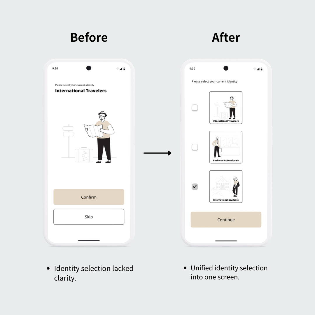
Participants hesitated during identity selection because each user type was presented on a separate screen. Several users interpreted the "Skip" button as skipping the entire onboarding process rather than selecting another identity, creating unnecessary friction before users reached the main experience.
Design Decision
Combined all identity options onto a single selection screen and replaced the ambiguous interaction with a clear Continue action. This reduced unnecessary navigation and made available choices immediately visible.
Expected Outcome
Reduce onboarding hesitation, improve first-time comprehension, and help users understand their available identity options without trial and error.
Iteration 02 — Category Clarification (Information architecture)
Problem
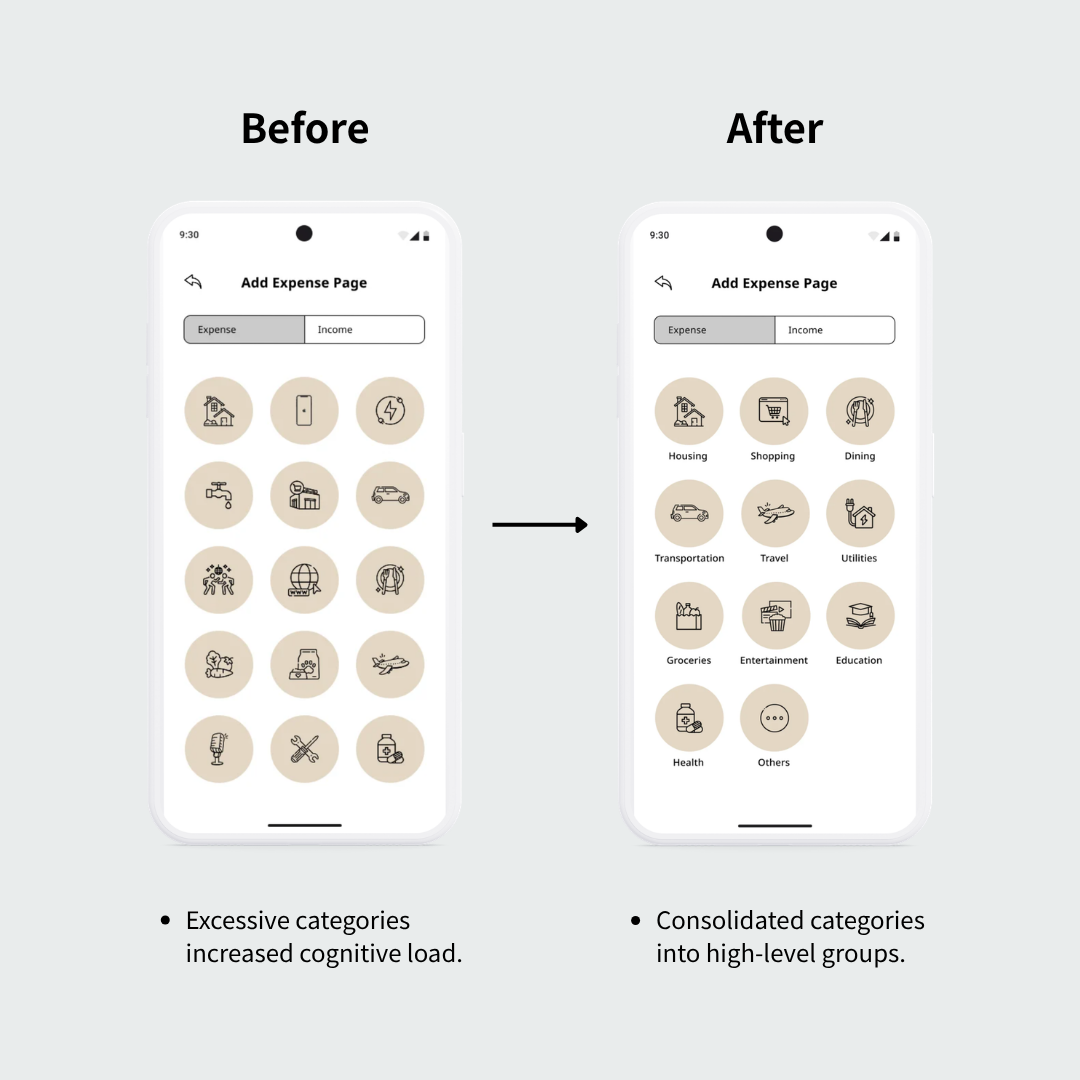
Participants frequently paused when selecting expense categories because many icons looked visually similar without accompanying labels. Users often compared multiple icons before making a decision, increasing cognitive effort and slowing task completion.
Design Decision
Grouped related expenses into broader categories and introduced text labels beneath each icon. The revised information architecture prioritized recognition over recall while reducing visual complexity.
Expected Outcome
Improve category recognition, reduce cognitive load during expense entry, and enable faster, more confident decision-making.
Iteration 03 — Currency UI Enhancement (Component refinement)
Problem
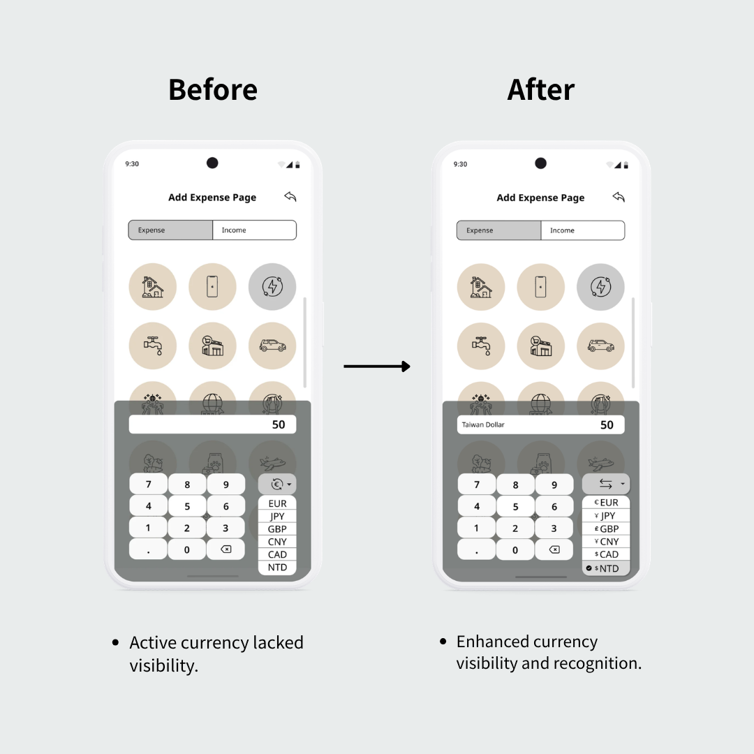
During multi-currency tasks, participants were often unsure which currency was currently active. Several users questioned whether exchange rates were applied correctly because currency abbreviations and conversion status lacked sufficient visual emphasis.
Design Decision
Redesigned the currency selector by increasing the visibility of the active currency, adding clearer labels, and strengthening visual hierarchy within the conversion component.
Expected Outcome
Increase confidence in currency selection, improve visibility of system status, and reduce uncertainty during multi-currency transactions.
Iteration 04 — Budget Flow Separation (Workflow redesign)
Problem
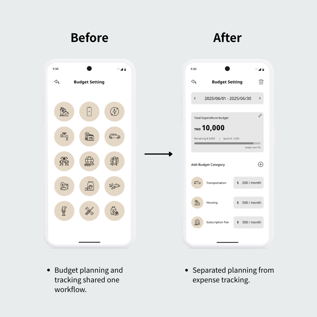
Participants expected budgeting to be part of financial planning rather than embedded within expense tracking. Combining budget setup, reminders, and expense recording into one workflow conflicted with users' mental models and made budget configuration feel difficult to discover.
Design Decision
Separated budgeting into a dedicated planning flow with its own overview, category allocation, and reminder settings, creating a clearer distinction between planning and daily expense tracking.
Expected Outcome
Better align the budgeting workflow with users' mental models, simplify budget management, and make planning tasks easier to locate and complete.
Project Outcome
• Designed and prototyped a complete mobile budgeting experience.
• Conducted moderated usability testing with three representative users.
• Identified nine usability issues and synthesized them into four design themes.
• Developed four design iterations based on usability findings.
Project Metrics
120+ Observations
3 Participants
4 Iterations
9 Usability Issues
100% Task Completion
Reflection
This project began with a personal assumption. As someone who frequently managed expenses across multiple currencies while studying abroad, I initially believed that improving currency conversion would be the primary design challenge. However, user interviews revealed a much broader picture. Participants had fundamentally different relationships with budgeting. Some viewed it as a way to reduce financial anxiety, others saw it as a tool for self-reflection, and some simply wanted an easier way to build consistent spending habits. These conversations shifted my perspective from designing around features to designing around people's motivations.
The usability testing phase further reinforced that many interface decisions I considered intuitive, such as icon-only categories, currency selection, and the onboarding flow, still caused hesitation during real use. Watching participants think aloud highlighted the gap between the designed experience and the actual user experience. It reminded me that design assumptions should always be validated through observation rather than intuition.
More importantly, this project changed how I think about UX design. I learned that successful interfaces are not created by adding more features, but by understanding users' mental models and translating research insights into simple, predictable interactions. Every iteration became less about refining the interface itself and more about reducing cognitive effort throughout the user's decision-making process.
Selected highlights from the project are presented here.
For deeper research insights, UX decisions, and design iterations, view the full case study below.
[ View Detailed Case Study → ]