

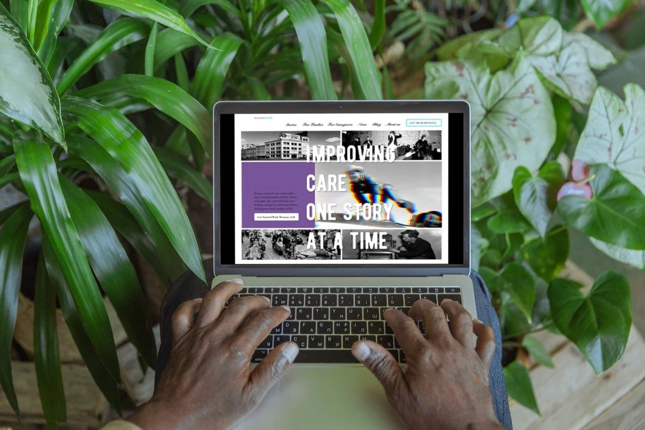
MemoryWell Homepage Redesign
Personal Concept Project • UI Design • 2018
Designing nostalgia as a digital experience
for dementia storytelling.
Project Story
MemoryWell was a U.S.-based startup that documented the life stories of people living with dementia through interviews conducted by retired journalists. By combining writing, photography, music, and video, the platform helped caregivers understand each person's identity beyond medical records.
While exploring the website, I was deeply inspired by its mission but felt the visual experience did not fully reflect the emotional value of the stories being preserved. Having previously worked at Ustory, a startup focused on storytelling experiences, I became interested in how visual design could strengthen emotional engagement for this meaningful service.
Rather than redesigning functionality, this project explored how interaction, imagery, typography, and editorial layouts could transform a healthcare website into a more memorable storytelling experience.
““The goal was not to redesign a website. It was to redesign how memories are experienced.””
Design Concept
01 | Pleasant Nostalgia 🎞️
Rather than emphasizing illness, I wanted the interface to evoke warm memories through carefully selected historical photography, vintage typography, and the brand's existing color palette. The goal was to create an emotional first impression that encourages users to explore personal stories with curiosity rather than sadness.
02 | Visual Storytelling 📷
Instead of presenting information as a conventional healthcare website, I treated each section as part of a visual narrative. Large imagery, editorial composition, and dynamic layouts encourage users to read stories naturally while maintaining emotional engagement.
03 | Fragmented Memory 🧩
To represent the way memories are recalled, I introduced subtle glitch effects, layered imagery, repeated icons, and fragmented compositions. These visual treatments symbolize incomplete yet meaningful memories instead of portraying dementia literally.
04 | Emotional Interaction ✨
Every visual element was designed to support emotional connection rather than efficiency alone. Even supporting sections such as testimonials and the footer were redesigned to extend storytelling until the very end of the browsing experience
Design Highlights
< Homepage_Setting a Pleasant Nostalgia
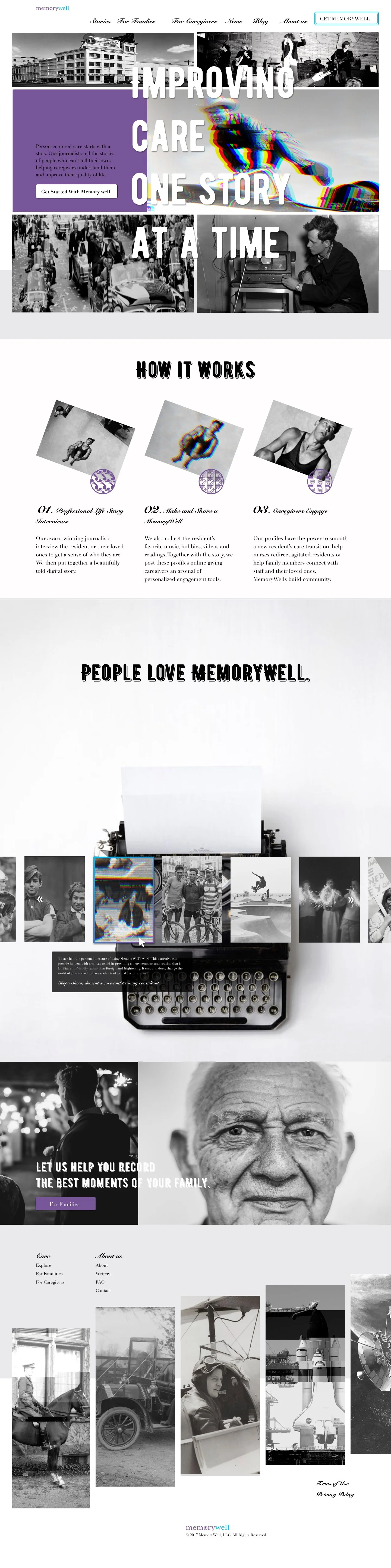
The homepage uses MemoryWell’s original purple and light blue palette, vintage photography, editorial typography, and image treatments to create a sense of pleasant nostalgia. Instead of framing dementia only through illness, I selected images of joyful activities and meaningful life moments to make memory feel warm, personal, and worth preserving.
< Service Operation Page_Turning Service Steps into Visual Storytelling
The service operation page transforms a standard “how it works” section into a more dynamic visual narrative. Enlarged images, unstable compositions, glitch effects, RGB shifts, and repeated icons were used to suggest that memory is fragmented, layered, and reconstructed over time.
< User Testimonials_Giving Reviews Historical Credibility
The testimonial section avoids generic review cards by using antique typewriters, family photographs, symbolic objects, and music references. Because MemoryWell’s service is built around retired journalists recording life stories, these elements give testimonials a stronger sense of authorship, history, and emotional authenticity.
< Call-to-action Page_Creating One Final Emotional Push
This page was added as a final invitation before users leave the website. Using the original “For Family” message, I paired a simple layout with intergenerational imagery to reduce visual overload while creating a direct emotional connection to MemoryWell’s core value.
< Footer_Ending with a Visual Timeline
The footer was redesigned as a final storytelling moment rather than a purely functional navigation area. Historical images are arranged like a visual timeline, allowing the browsing experience to end with curiosity, memory, and a stronger emotional aftertaste.
Reflection
This project taught me that visual design can shape emotional perception just as strongly as functionality.
Rather than focusing solely on usability, I explored how photography, typography, composition, and interaction could communicate empathy and preserve personal memories. The challenge was not designing a healthcare website, but designing an atmosphere that respects the dignity of people's life stories.
Looking back, I see this project as an early exploration of emotional experience design. It strengthened my interest in using visual storytelling to create digital products that people not only use, but also remember.
Selected highlights from the project are presented here.
For deeper research insights, UX decisions, and design iterations, view the full case study below.