


Soulmate
Mature Companionship Platform Concept
Personal Concept Project · UI Design · 2018
Designing a mature companionship platform inspired by everyday observations about companionship, aging, and second chances.
Project Story
This project began with a simple observation from everyday life. Growing up, I often heard older adults talk about regretting the relationships they chose when they were younger. As people's values, priorities, and emotional needs change throughout life, I realized that finding a compatible life partner is not a one-time decision. It can evolve with time.
That observation led me to explore a question:
What if dating platforms were designed specifically for mature adults, rather than simply adapting products built for younger generations?
Instead of redesigning an existing dating app, I envisioned a new platform centered around companionship, privacy, dignity, and emotional comfort for middle-aged and older adults.
Core Insight
Most dating platforms are designed around younger users.
Through conversations with several older adults, I discovered that many were interested in building new relationships, yet often felt excluded by existing dating services. They disliked being labeled as "old," valued attractive and modern visual design, and cared deeply about privacy and personal security.
The design challenge was not simply to create another dating platform, but to build an experience that respected the emotional needs, privacy concerns, and social realities of mature users.
Startup Concept
Soulmate is a conceptual companionship platform created for middle-aged and older adults seeking meaningful relationships.
Rather than emphasizing romance alone, the platform focuses on emotional trust, personal dignity, and comfortable communication through visual storytelling, thoughtful interaction, and privacy-first design.
The goal is to create an environment where mature relationships feel natural, respectful, and free from social stereotypes.
Design Direction
01/ Human Warmth 😊
Portrait photography becomes the emotional foundation of the interface. Real people and authentic stories create a welcoming atmosphere that feels closer to human connection than online dating.
02 / Emotional Balance 💗💙
The visual identity combines pink and blue to represent two emotional states of relationships—emotion and reason. Together they reflect the emotional complexity of mature companionship rather than youthful romance.
03 / Privacy & Trust 🔒
Privacy became one of the strongest insights from conversations with older adults. The interface, messaging, and interaction design were intentionally created to reduce social pressure while building confidence and trust.
04 / Dignified Romance 🌿
Instead of designing a platform that visually communicates "aging," I wanted the experience to feel elegant, contemporary, and emotionally uplifting—celebrating companionship without reinforcing age stereotypes.
Landing Page Highlights
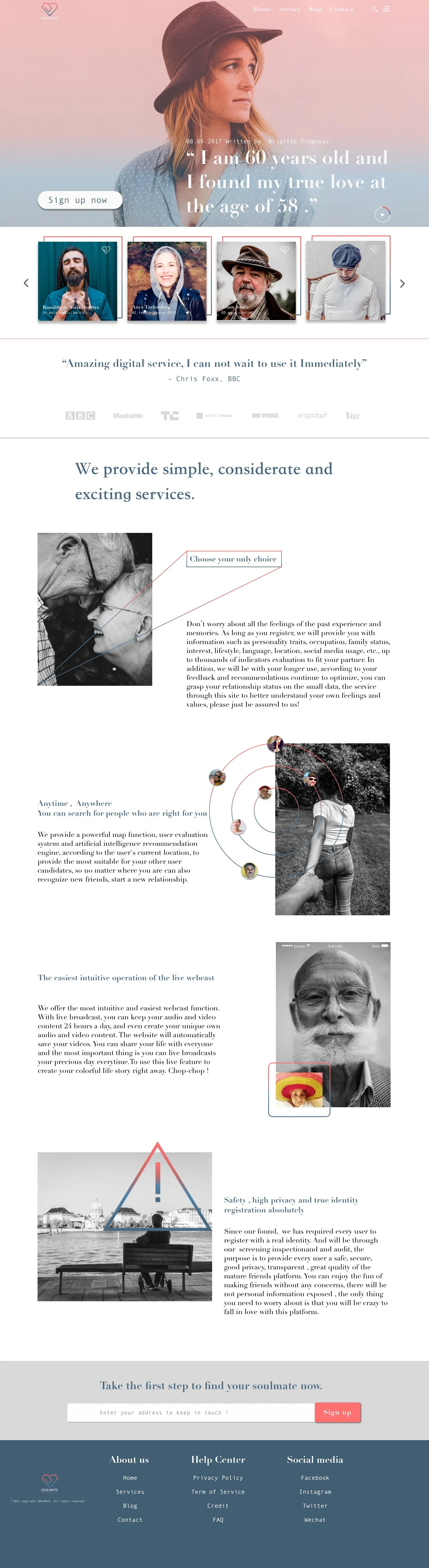
Homepage >
Large portrait photography introduces the platform through the voices of its users rather than its features. Rotating stories from ordinary people who found meaningful companionship create a stronger sense of authenticity than promotional messaging, allowing trust and emotional connection to emerge before users begin exploring the service.
< Profile Discovery
Rather than overwhelming users with detailed profiles, only key information is presented to support comfortable exploration. The favorite feature encourages visitors to register, save profiles they are interested in, and continue following each person's updates. This creates a slower, more natural relationship-building process while increasing long-term engagement with the platform.
Media Recognition >
Rather than filling the page with promotional content, media mentions are presented subtly to build credibility without making the experience feel overly commercial.
< Core Experience
Black-and-white portraits establish authenticity, while colorful geometric graphics introduce a playful visual rhythm throughout the interface. This contrast softens the experience, creating a service that feels friendly, engaging, and emotionally approachable without losing its sense of maturity.
Call-to-Action >
The registration experience intentionally avoids aggressive marketing. Minimal copy and generous whitespace encourage users to take the first step comfortably, without creating unnecessary pressure.
< Footer
The browsing experience concludes with a simple and spacious footer. Instead of ending with information overload, it provides a calm visual pause that reinforces trust and leaves the experience on a warm, reassuring note.
Reflection
This project began with an observation about relationships, but it gradually became an exploration of how design can support emotional wellbeing across different stages of life.
Rather than treating mature adults as a niche audience, I wanted to understand their hopes, concerns, and social realities, then translate those insights into a more respectful digital experience.
Looking back, Soulmate strengthened my belief that meaningful products are often born from empathy before technology. Sometimes the most valuable design opportunities begin by paying closer attention to people whose needs are often overlooked.
Selected highlights from the project are presented here.
For deeper research insights, UX decisions, and design iterations, view the full case study below.